Google’s Material Design is perhaps the most influential visual design philosophy for both web and mobile in existence today. Material Design has taken the front end world by storm, with specialized integrations for virtually all of the major SPA frameworks including React, Angular, and Vue. Google has made a huge investment in Material Design, and it is the product of an unfathomable quantity of scientific research and design.
By using Material Design:
- You can avoid a lot of the pitfalls of rolling your own visual design.
- Your users may feel at ease since they are most likely already familiar with its paradigm through the use of various Google products.
- You are giving out a subtle cue that your site is just as professional and trustworthy as a Google product.
The Challenge
It’s not obvious how to make a Material Design based theme for Liferay. Liferay’s “Classic Theme” and “Styled Theme” are both based off of Bootstrap, and while Bootstrap has some similarity with Material Design (for example, both have “cards”), Bootstrap is a distinct visual design, more associated (historically) with Twitter than with Google.
What’s more, Bootstrap is baked into the core of Liferay’s theme system, being part of Clay. Clay is Liferay’s web implementation of the Lexicon Experience Language, which is built with Bootstrap as a “foundation”. Completely removing Bootstrap from a Liferay theme would likely cause massive amounts of chaos and destruction, if it’s even possible at all. Yet naively layering Material Design on top of Bootstrap seems like a recipe for conflict and pain also.
So, somehow Bootstrap and Material Design have to coexist nicely with each other. Is it possible? The good news is that there is a library that has already done the heavy lifting: it’s called, appropriately enough, “Material Design for Bootstrap” https://fezvrasta.github.io/bootstrap-material-design/
However, there is still a key technical challenge. The SCSS (Sass) of Bootstrap Material Design files aren’t supposed to layer on top of the SCSS files of Bootstrap, they are supposed to completely replace them. If you understand the architecture of Liferay themes, you can see why this would pose a problem– Liferay’s Clay does not make swapping out Bootstrap SCSS files trivially easy, but it’s possible. So let’s dig in…
Starting Point
Let’s create a card with Material Design markup. We’ll implement as a Liferay Page Fragment component. If you are not yet familiar with Page Fragments, please read some docs starting with the Page Fragment Development Guide: https://help.liferay.com/hc/en-us/articles/360028726832-Page-Fragments
Use the following markup:
<div class="card material-design-demo-card" style="width: 18rem;">
  <lfr-editable id="cardimgtop" type="image">
    <img class="card-img-top" alt="100%x180" style="height: 180px; width: 100%; display: block; object-fit: cover;" src="data:image/svg+xml;charset=UTF-8,%3Csvg%20width%3D%22288%22%20height%3D%22180%22%20xmlns%3D%22http%3A%2F%2Fwww.w3.org%2F2000%2Fsvg%22%20viewBox%3D%220%200%20288%20180%22%20preserveAspectRatio%3D%22none%22%3E%3Cdefs%3E%3Cstyle%20type%3D%22text%2Fcss%22%3E%23holder_16cd96eb677%20text%20%7B%20fill%3Argba(255%2C255%2C255%2C.75)%3Bfont-weight%3Anormal%3Bfont-family%3AHelvetica%2C%20monospace%3Bfont-size%3A14pt%20%7D%20%3C%2Fstyle%3E%3C%2Fdefs%3E%3Cg%20id%3D%22holder_16cd96eb677%22%3E%3Crect%20width%3D%22288%22%20height%3D%22180%22%20fill%3D%22%23777%22%3E%3C%2Frect%3E%3Cg%3E%3Ctext%20x%3D%22108.1875%22%20y%3D%2296.24375%22%3E288x180%3C%2Ftext%3E%3C%2Fg%3E%3C%2Fg%3E%3C%2Fsvg%3E">
  </lfr-editable>

  <div class="card-body">
    <h5 class="card-title">
      <lfr-editable id="cardtitle" type="text">
        Card title
      </lfr-editable>
    </h5>
    <p class="card-text">
      <lfr-editable id="cardtext" type="rich-text">
        Some quick example text to build on the card title and make up the bulk of the card's content.
      </lfr-editable>
    </p>
    <lfr-editable id="cardbtnprimary" type="link">
      <a href="#" class="btn btn-primary">
        Go somewhere
      </a>
    </lfr-editable>
  </div>
</div>
If you place this page fragment component on a content page, you should see this:
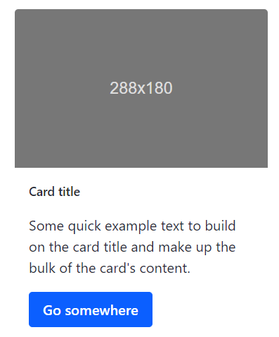
That’s pretty ugly, isn’t it? Let’s see what Material Design can do.
Implementation
This tutorial assumes you have Liferay DXP 7.2 already installed.
Make sure you have node installed. https://nodejs.org/en/download/.
Install Blade: https://portal.liferay.dev/docs/7-2/reference/-/knowledge_base/r/installing-blade-cli
If you already have Blade installed, update to the latest:
$ blade update
You will need to globally install gulp, yeoman, and the Liferay theme yeoman generator:
$ npm install -g gulp-cli yo generator-liferay-theme
Go into the directory in which you want to create the theme. Then run the generator.
$ yo liferay-theme
You will get prompted for questions, here’s how I answered them:

Font Awesome may not be strictly necessary since we will use material icons, but, continuing:

Let’s test the deploy pipeline:
$ gulp deploy
Look for something like this in your Tomcat logs:

Then, sign in to your Liferay instance. Go to Pages, Public Pages, and click the gear icon:
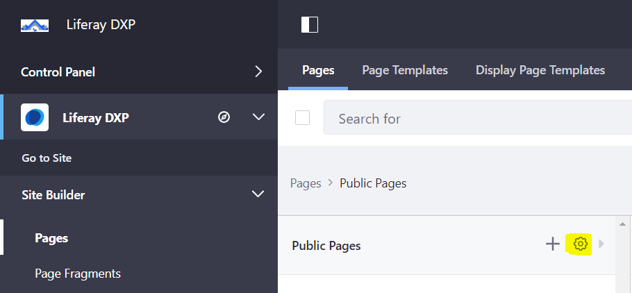
Under Look and Feel, click Change Current Theme. If you see our new theme, you are successful so far. Go ahead and click Material Bootstrap Theme.
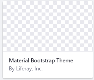
And Save.
At this point, we have a raw theme based off of Liferay’s “styled” theme, but it doesn’t look hardly styled at all yet. Customizing this styled-based theme is way beyond the scope of this blog post, but you can read the docs or take the Front End passport course to get an idea. Good theme documentation starting point: https://help.liferay.com/hc/en-us/articles/360022488251-Theme-Components-and-Workflow
Passport course: https://passport.liferay.com/front-end-developer
Our focused mission objective here is to get Material Design installed so let’s move forward.
First, we need to understand how Bootstrap is integrated into the theme. It’s located in the build/css/clay directory, which also contains base.scss, which we will need to change later.
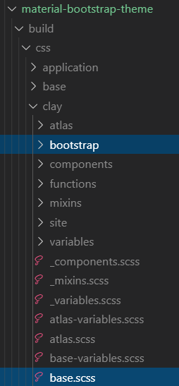
Copy the entire clay directory over from build to src:
$ cp -r build/css/clay src/css
Download the source code for Bootstrap Material Design. Unzip this file: https://github.com/FezVrasta/bootstrap-material-design/archive/master.zip
Extract the scss directory within that zip archive:
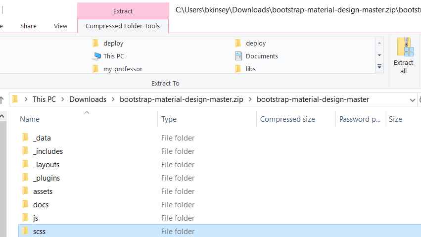
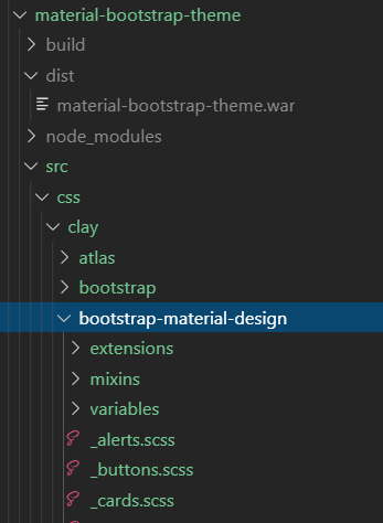
Put it in your src/css/clay directory and call it bootstrap-material-design. If you were successful, you should have a directory structure that looks something like this:
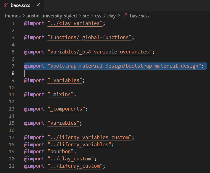
Edit line 7 of src/css/clay/base.scss so it points to bootstrap-material-design:
For reasons I don’t fully understand, it was also necessary for me to edit lines 6-8 of src\css\clay\bootstrap-material-design\_core-bootstrap.scss:

And line 4 of the src\css\clay\bootstrap-material-design\_core.scss:

And lines 56-57 of src\css\clay\bootstrap-material-design\_variables.scss:

I also found it was necessary to add lines 13-19 to src\css\_custom.scss:
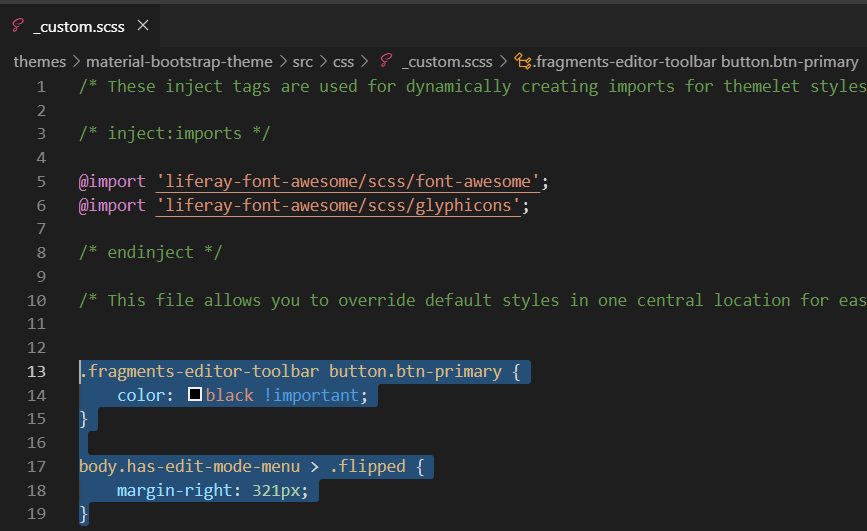
And a big caveat that if you were to use this theme in the real world, you would need to do more of this kind of work to make Liferay’s admin UI usable with this new theme.
Deploy, wait for Tomcat to start the theme, and see if you get any errors.
$ gulp deploy
Success! (Hopefully…?)
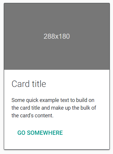
If you were successful with this tutorial, your card (implemented as a Liferay Page Fragment component) should look fully Material Design now:
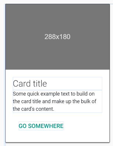
Furthermore, all the text should be editable in Liferay’s edit mode, in the manner of any other Page Fragment:
Summary
This is a proof-of-concept that you can add Material Design to your Liferay theme. In the real world, to use this well, it would take at least several hours of dev work to fix some of the broken bits of Liferay’s UI that assumes Bootstrap. Maybe this could be a topic of another blog post if anybody is interested. One workaround, if you don’t want to do this work of customizing Liferay UI’s CSS, is to switch off your custom theme while you are editing the site and only switch it back on when you are ready for the end-users. Obviously, that workaround has limitations.
Otherwise-enjoy your shiny new Material Design visual paradigm!
If you have any questions at all, please engage with us via comments on this blog post, or reach out to us at https://www.xtivia.com/contact/.

